strategy
achieving simplicity with complexity
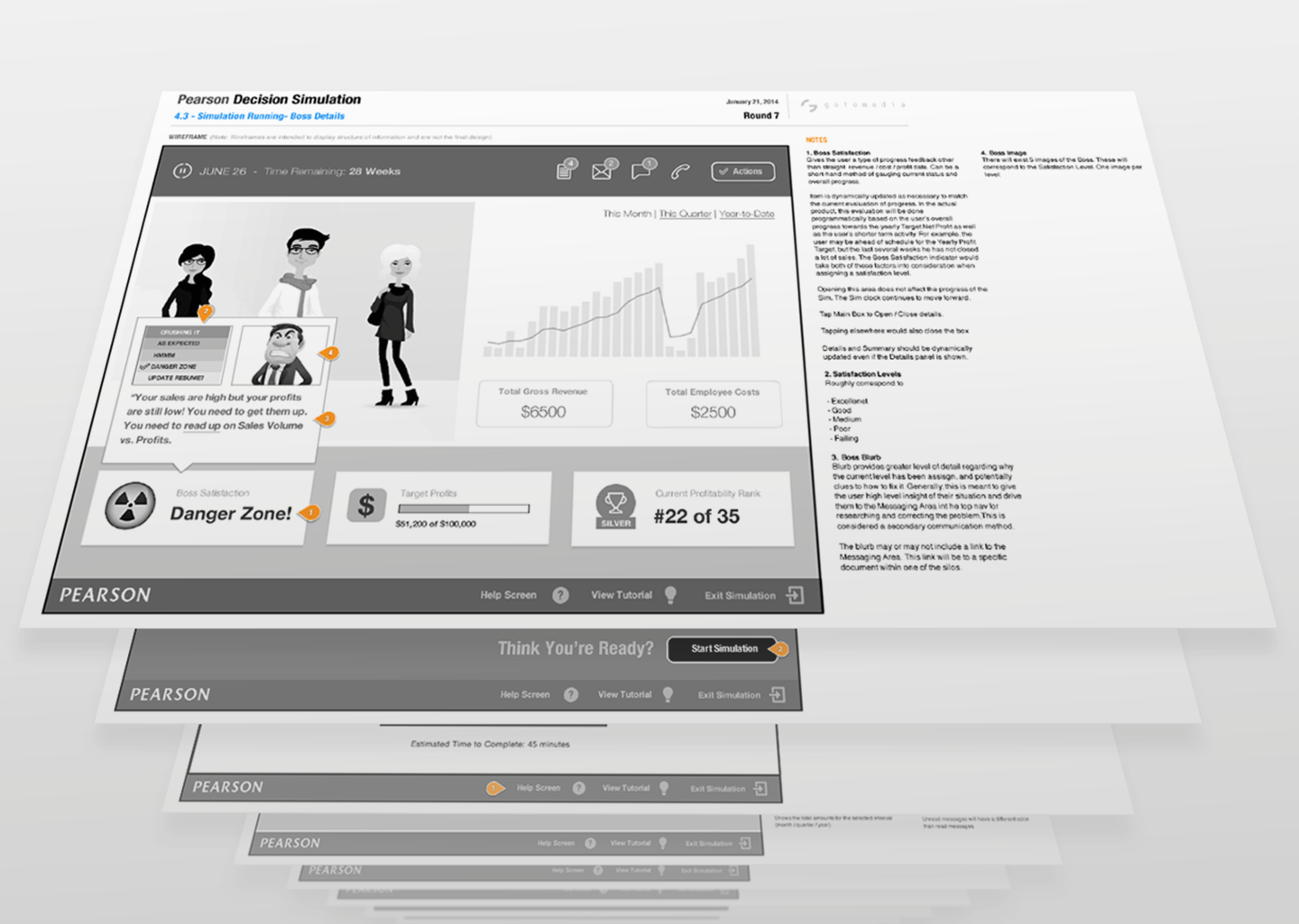
The UX design solution mandated that students find the simulations engaging and entertaining, while ensuring that complex concepts were clearly illustrated and learned. The gotomedia team ideated several solutions with a focus on gamification. Collaborating with domain experts and professors on subject matter, a prototype was created and tested with students in order to hone the interface details and interaction design. The final outcome was a proof of concept used as a template for product developers to create new simulation modules.

ux
a framework for interactive modules
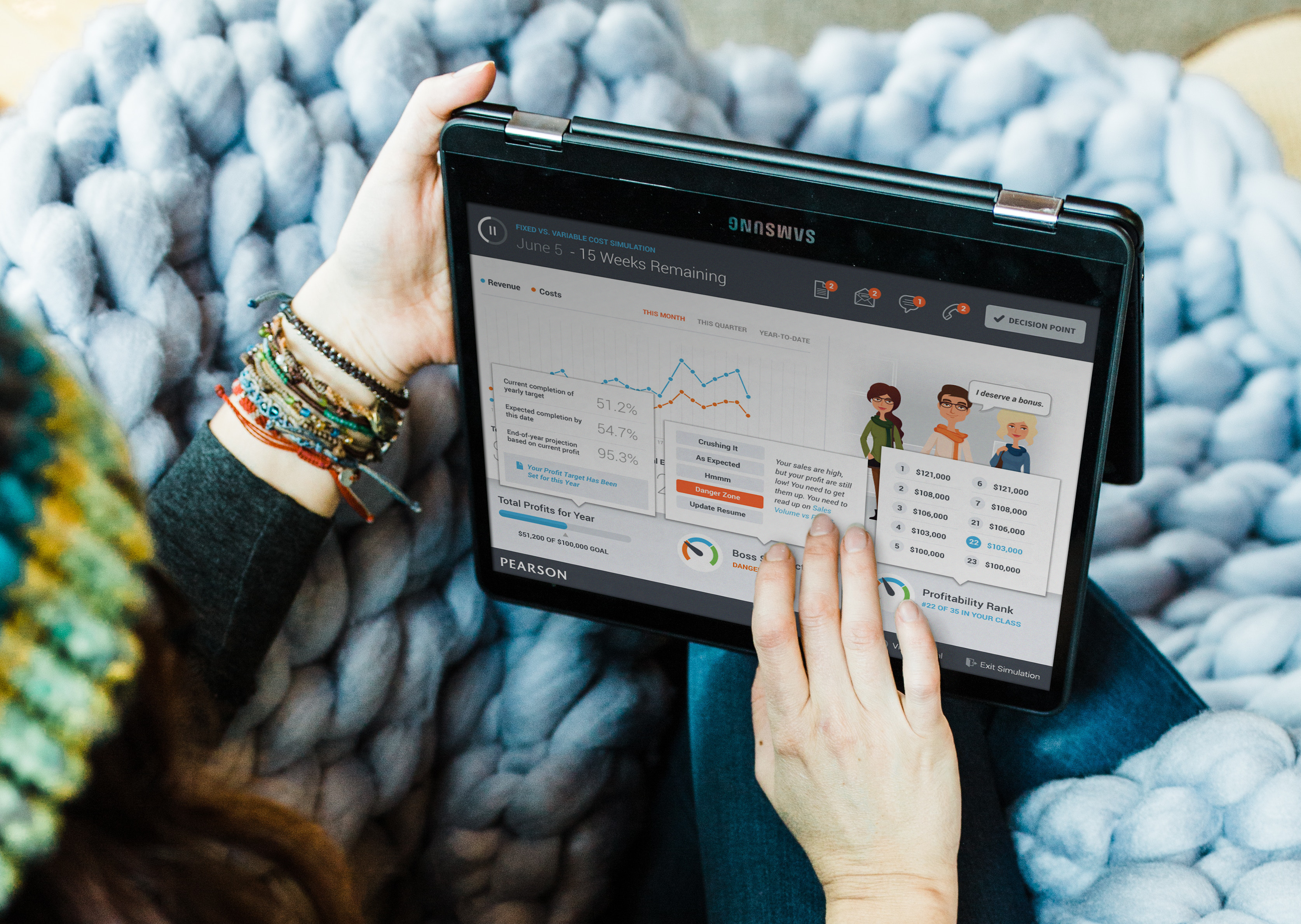
A range of techniques were used to create a UI that was both educational and engaging and to promote completion modules. The primary dashboard featured competing forms of communication to simulate real work environments. Students were asked to aggregate information coming from different communication channels including email, text and mock phone calls, while answering questions relating to the subject matter. Students compete anonymously with other classmates for high scores. At key intervals, students were provided with performance analysis and guidance on successfully completing failed tasks. A final component of the UX phase was creating a Learning Guide for product developers to easily produce new models for other lessons and classes.
visual design
personality that can be replicated
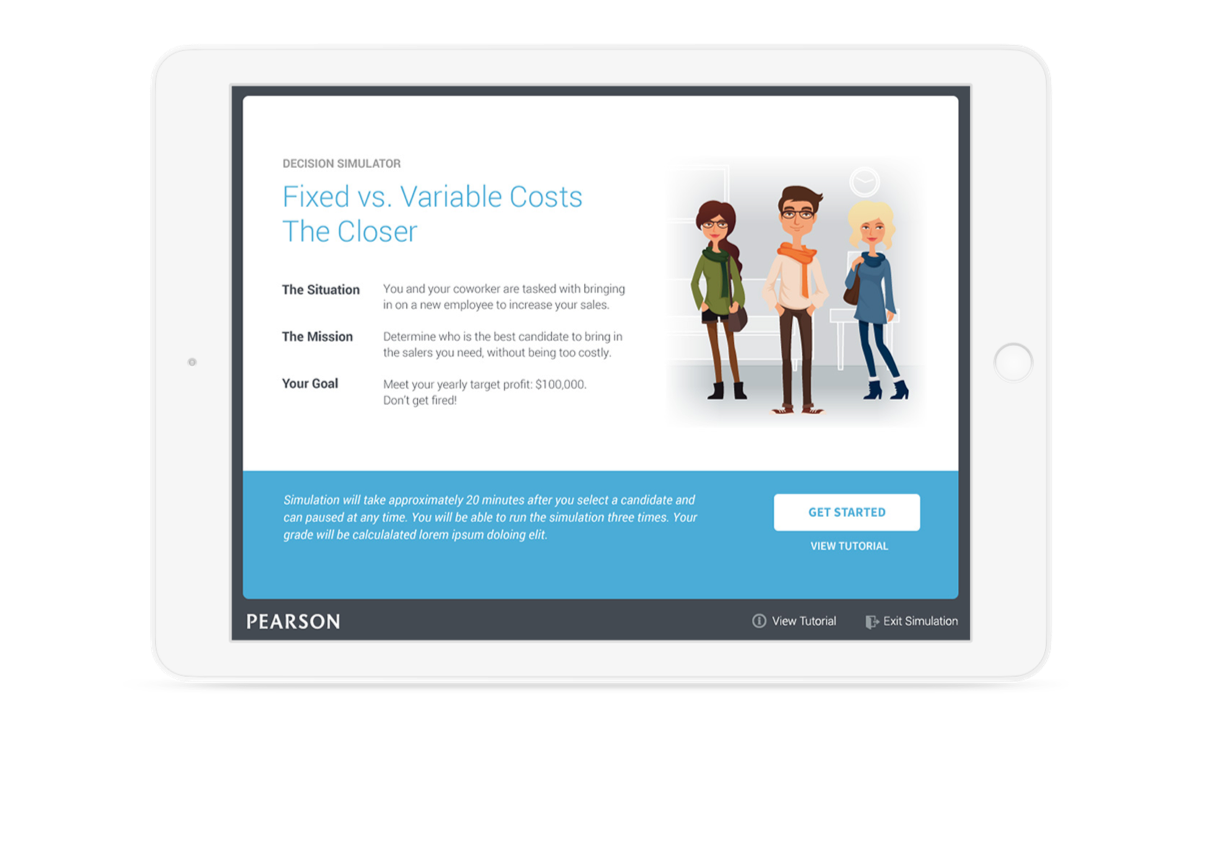
A UI dashboard that at first glance felt easy and fun to use, along with custom character illustrations, were both key components of the visual presentation. The characters appealed to the student target audience and lent a playful element to the UI. In testing, the characters and simple dashboard presentation resonated with students as a more intelligible way to engage with subject matter that was often presented with an overwhelming amount of text and very few visuals. While the characters added personality and approachability to the UI, they were also required to be easily reproduced for additional modules. As a final deliverable, modular “character kits” were created for easy reproduction in new modules.have a project for us?


