strategy
helping to navigate complex data
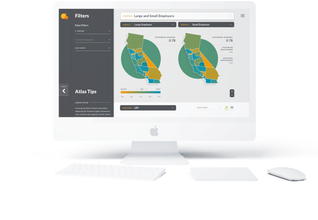
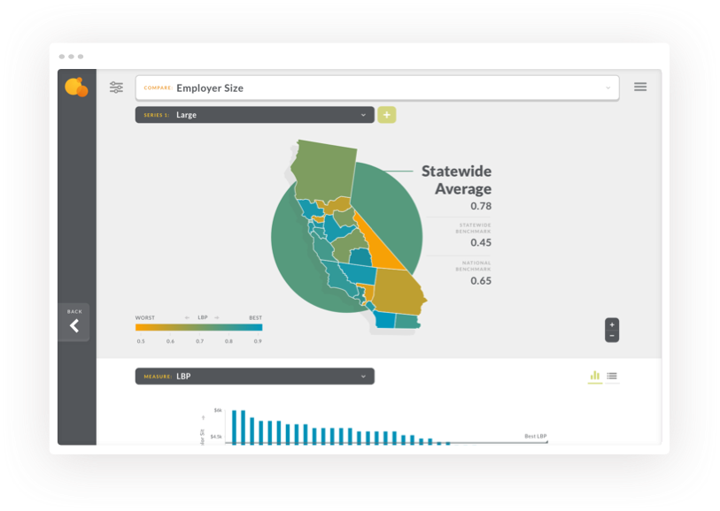
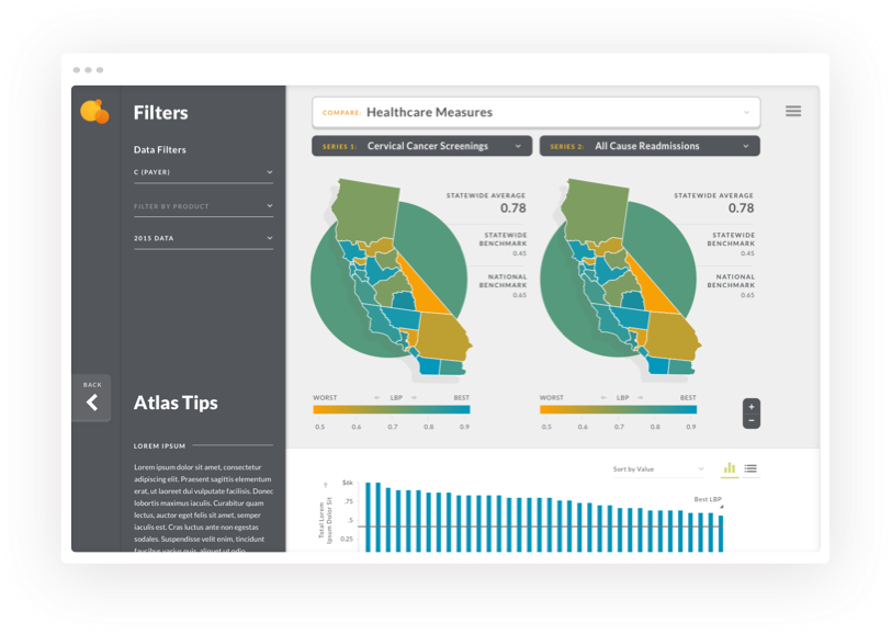
Our goal was to determine a way to show quality and cost metrics from hundreds of groups and put it together to make it easier to understand for a broader audience with lower than average technical abilities.
ux
re-architecting and creating new user flows
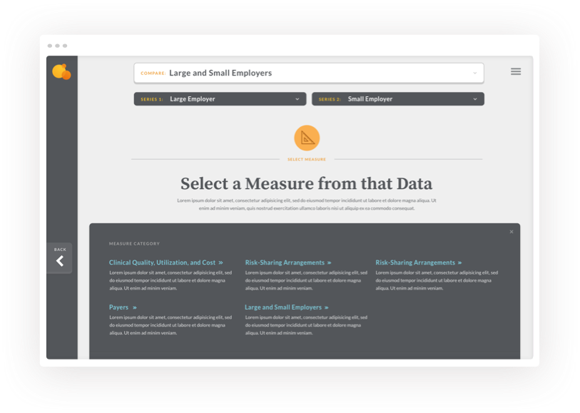
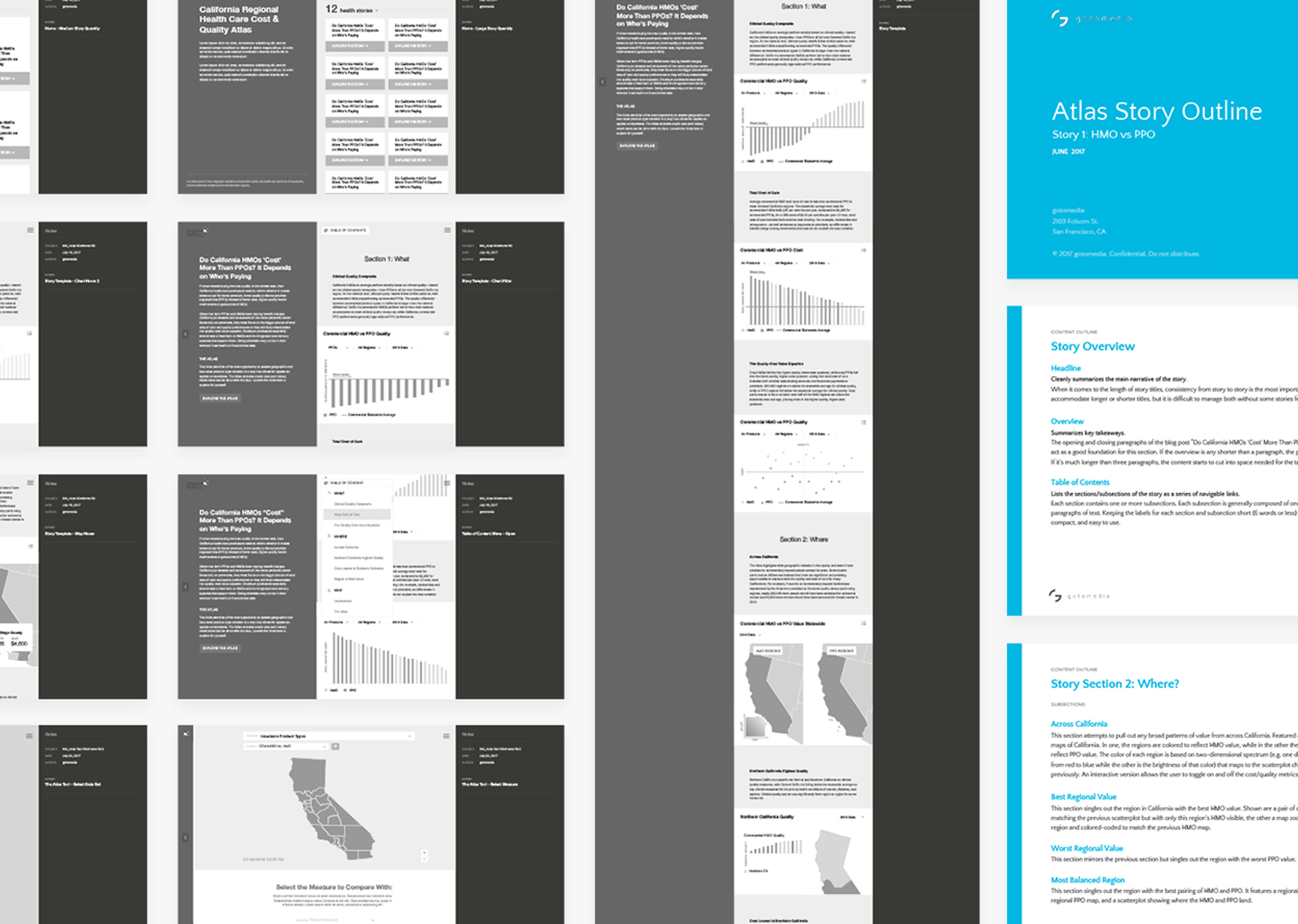
As part of the UI redesign, we rethought how users moved through the site. At the project outset one of the key issues was that people didn't understand how the tool was valuable to them. They needed to see it in action, so we created "stories" to illustrate how the tool could be used. This created abetter flow to guide users into the tool, helping them understand by using a set narrative.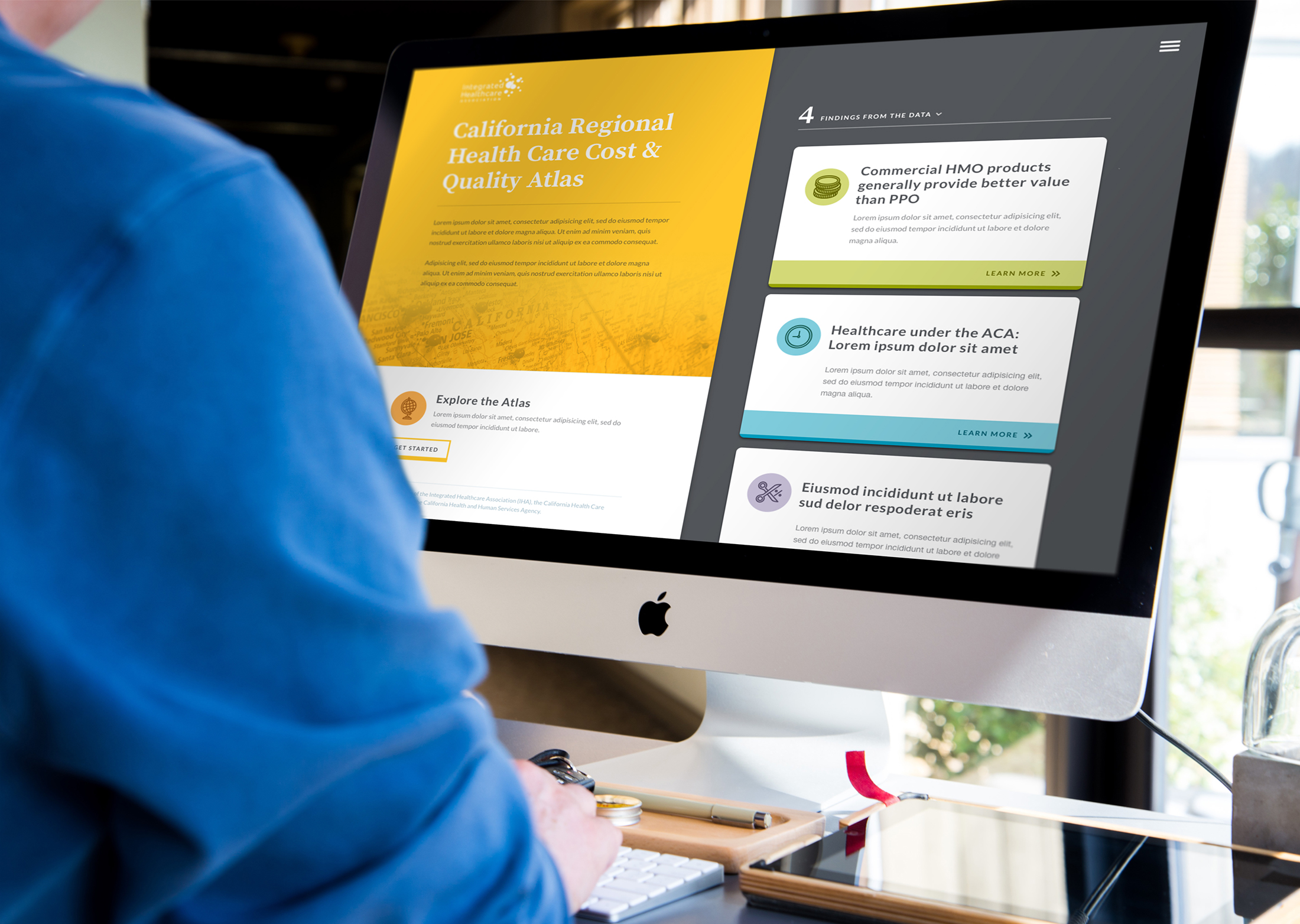
visual design
leaning on the familiar and friendly
We sought to present a dynamic and clean interface that was optimized for reading. The palette lent itself to the familiar feel of old national park guides. We also drew from the idea of an atlas and used photography of natural landscapes in California. The goal for the look and feel was professional and trustworthy, while while maintaining friendliness and approachability.have a project for us?


