research
revealing perceptions and needs
In order to better understand the pain points for consumers of website security products and SSL certificates, gotomedia conducted user research across a range of Symantec security and SSL brands. Several user segments were interviewed in order to dig deeper into needs according to role, technical ability and company size and to discover knowledge gaps and unmet needs. Internal Symantec stakeholders were interviewed to gain insight into business goals that informed strategy for the information architecture. A competitive analysis rounded out the research phase by providing perspective into the website security product landscape.
strategy
differentiation in an ambiguous marketplace
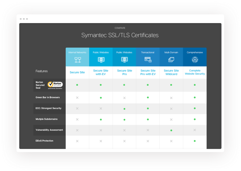
We helped buyers understand differences in product offerings by clarifying the relationship between product as well as with the larger security product suite. This extended beyond SSL to other Symantec security offerings.
ux
cybersecurity wayfinding
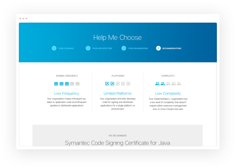
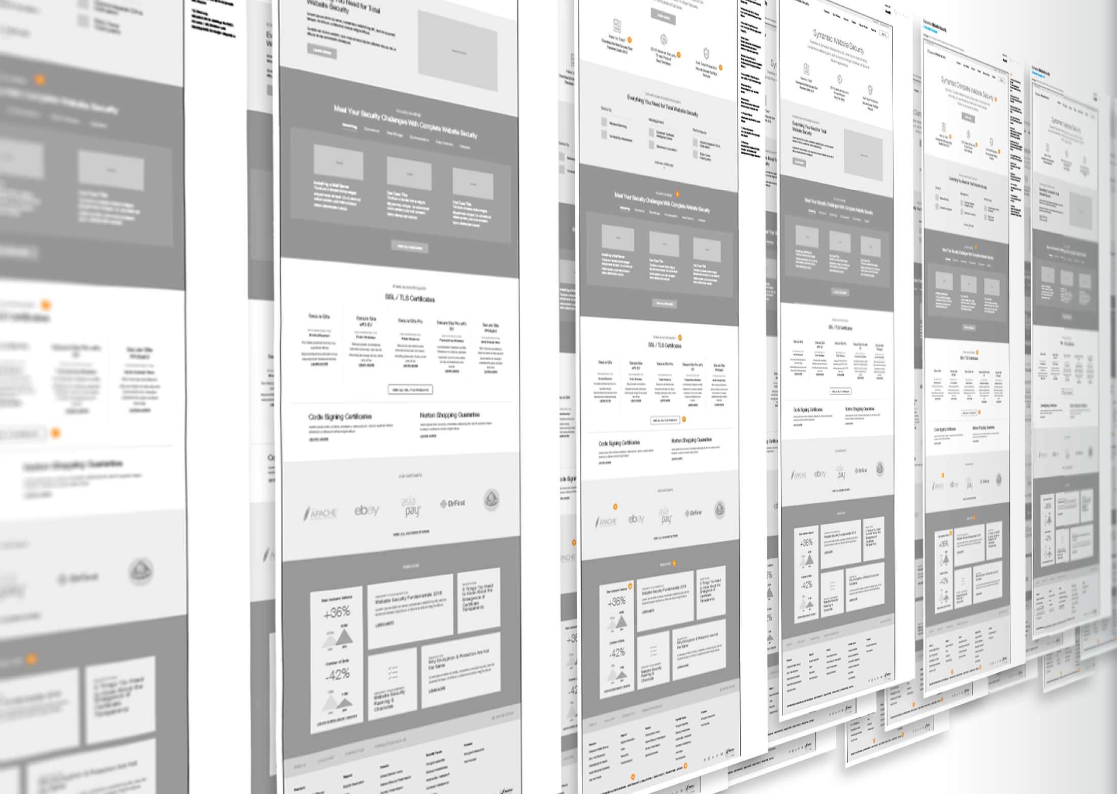
We needed a clear differentiation of products and alternative pathway mapping to get visitors to the right product. The resulting UX solution provided assistance in confidently choosing the most cost effective and beneficial product to best meet website security needs.
visual design
creating a parent/child brand connection
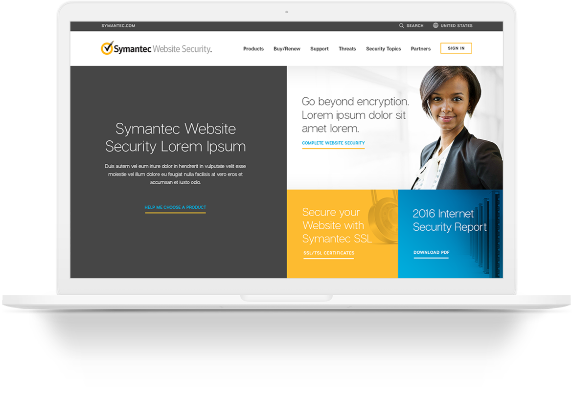
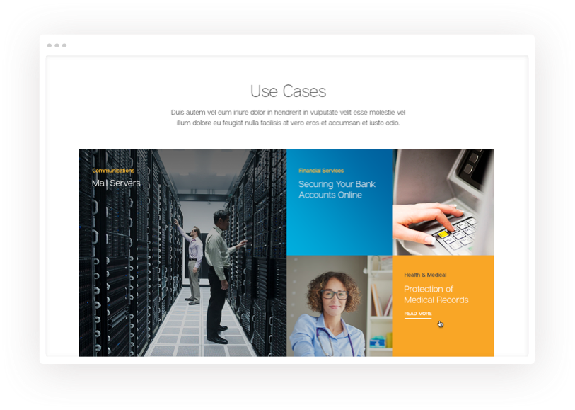
The main visual design focus for the WebsiteSecurity site was to create visual differentiation while maintaining some relationship with the parent brand. This involved integrating the Symantec "gold" color, but moving towards a unique photography style and a fresh and updated look and feel. The client also requested a stronger message about website security distinctive from Symantec enterprise security while also featuring their global leadership credentials.have a project for us?


